Forms
A form allows you to capture data, gather opinions and receive information in a consistent format.
This pattern provides practical and visually enriched guidelines for creating forms that are flexible to business domain, user experience and channel.
Form controls align to a column layout with an even number of columns across breakpoints.
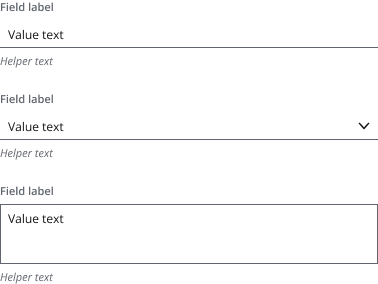
A form control consists of a form field wrapped around:
- An input
- A combo box
- A dropdown
- A radio button or checkbox group
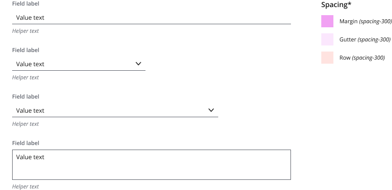
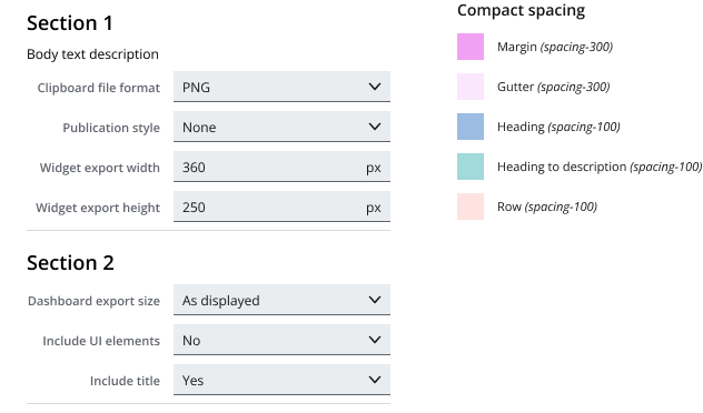
*You can find more information on the Salt spacing system here.
- Align the width of a form field to the number of columns that best reflect the length of its expected text.
- Use the Figma “Salt Layout Grid” style library, which aligns to Salt breakpoints. Simply pick the style that fits to your density and frame width.
- Use “Compact layout” for very data-dense forms.
Embed your form in the application layout when the form is:
- Long and complex, or requires multiple columns.
- A self-contained workflow, such as a log-in page—which may include an element of background branding.
Typically displays smaller forms that:
- Collect information to inform a larger workflow.
- Display on application boot (i.e., as the app loads).
- Enable access/feedback (i.e., credentials input, reviews).

In both cases, align the form to a layout grid within the viewport.
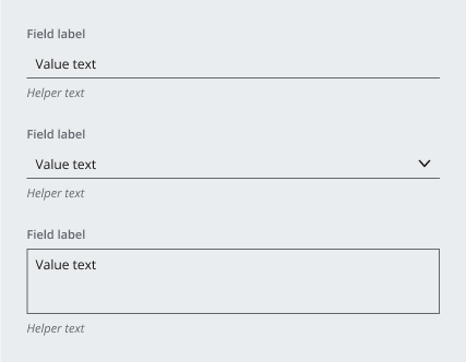
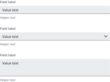
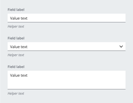
Salt provides primary and secondary variants of both form fields and backgrounds.
To keep busy forms as simple as possible, choose a combination of these fills to achieve a visual hierarchy. Rather than adding background colors, if you need further visual separation, use:
Choose the combination that best fits:
- The visual priority of the form (i.e., is it the primary focus?).
- The volume and type of data the form is collecting.
- The user familiarity with the form.
Effective for a form that:
- Is 'non-specialist' or infrequently used.
- Isn't space constrained/doesn't need to be entirely visible.
- Has minimal sections/columns.
Alternate option to form 1a, but not a common combination.
Effective for a form that:
- Is used by experts/is frequently used.
- Is compact and data-dense.
- Has multiple sections/columns.
Alternate option to form 2a, to display the form as a secondary priority.
Use a bordered multiline field when the form field fill matches the background fill.
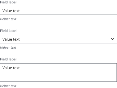
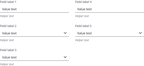
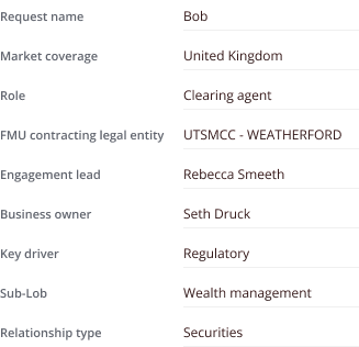
You can display form fields with either:
- A short label
- A comprehensive question
- Default choice for form fields.
- Field labels should be short and descriptive, with no more than 3-5 words.
- Uses a secondary ‘Label strong’ type style.
- Label with "sentence" intent
- Generally no limit to the word count of a field question (it wraps over multiple lines).
- Brings emphasis to the question, over the field content.
- Commonly used to create questionnaires and surveys.
- Uses a primary ‘Body strong’ type style.
You can combine labels and questions in the same form (although not in the same form field). In this case, use top placed labels.
Forms support either a top or left label placement.
The default label placement for form fields. Top placement offers:
- The most scannable solution, allowing users to traverse the left edge of the form through labels, fields and, finally, onward actions.
- The fastest completion times.
- The best label placement across varying devices and viewport sizes.
- The most accessible/compatible with browser zoom.
- You can align labels on the left of the form control to the left or right.
- Often used in very dense, “compact” forms, where the quantity of visible fields is more important than completion time and viewport size.
- Default alignment for left placement.
- Maintains proximity of labels to fields.
- Often used for dense, editable forms, such as tickets.
- Commonly when users need to review, or take care entering form information.
- Generally slower completion time (due to variable label proximity to field).
- Use cases include form summaries or to collect sensitive information.
- Ensure both top and left placed labels align to the same layout grid configuration.
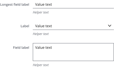
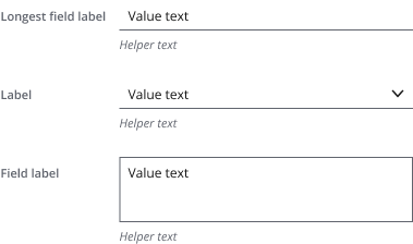
- All left placement labels in the form should have the same width (determined by the field with the longest label).
- Avoid left placement when the form is displayed in different languages, or on mobile/smaller viewports.
- We don’t recommend mixing label placements across the same form.
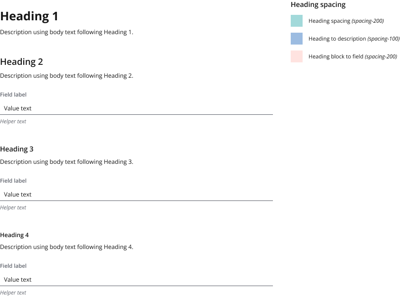
Headings create more visual separation (after choosing field and background fill color) and group related fields, to help users complete forms:
- Each heading adds space above for more separation in the form.
- If your heading is followed by a description, spacing is reduced to reinforce the relationship between heading and description.
Use horizontal separators to increase visual hierarchy in addition to fills and headings. They use the tertiary separator style to denote sections of related fields or information.
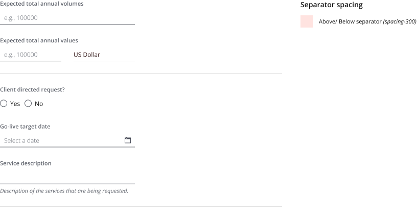
- Break a long form up into sections (or sequential steps) of, ideally, 7 (+/-2) form fields (Miller’s Law).
- Inset separators so that they don’t extend into the column layout margin.
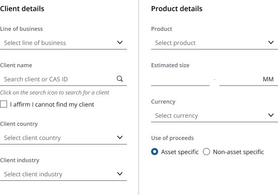
You can display form fields across multiple columns, and are best:
- For experienced users or routine user tasks, where the form is familiar.
- When vertical space is at a premium and you need to reduce scrolling.
- When you need an additional “summary” column (typically the left column) for comparison.
- Use top-placed labels with columns to maintain a clear relationship between field and label.
- For ADA compliance, forms must adhere to WCAG 2.1 Reflow, which requires the relationship between content to remain clear at 400% zoom. Use a top-down reading order to ensure that form fields maintain a logical order as they reposition at different browser zoom levels.
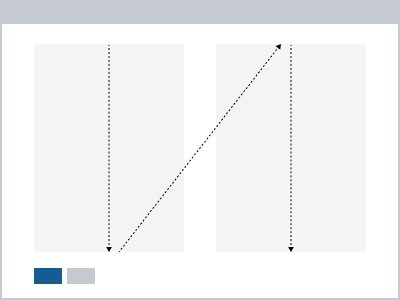
If form fields in different columns aren’t related to one another, use headings and vertical separators (in a secondary style) to ensure that completion order is clear.
In this case, align each column to its own layout grid, with the separator attached to the right margin of the preceding column. This ensures adequate separation between columns and separators.
Progressive disclosure is the reveal of content (i.e., fields or information) at the right time for your user. It helps to avoid overwhelming users by hiding sections of fields until they need to see them.
You may use this to:
- Display a long form in a single page.
- Vary the fields displayed depending on a user selection or change in context.
- Ask the user to opt in to sections, or fields, before completing them.
- These use accordions to progressively reveal fields in long, dense forms.
- Sections aren't mutually exclusive. Users can expand multiple to compare.

- Expand the first section on displaying the form.
- Align the left edge of fields to the accordion label and the right edge to the underlying layout grid.
You can combine nonexpandable and expandable sections within a single form, aligning to the same underlying layout grid.

Use checkboxes to allow users to opt in to certain sections of the form to reveal more information.

Occasionally it’s necessary to display a data-rich form in a small viewport without reducing the component density. In this case, you can reduce or remove spacing to achieve a compact form layout.
Use these layouts to display a:
- Dense editable form, such as trade tickets.
- (Read-only) summary of a form (on their own page or an accompanying left summary column).
If a compact form is editable, you should display it with:
- Secondary fields.
- Primary background.
- Right-aligned labels (see “Label placement”).
If a compact form is for reference (e.g., a summary/comparison), you should display it with:
- Primary fields.
- Primary background.
- Read-only state.
- Left-aligned labels (see “Label placement”).
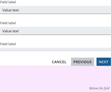
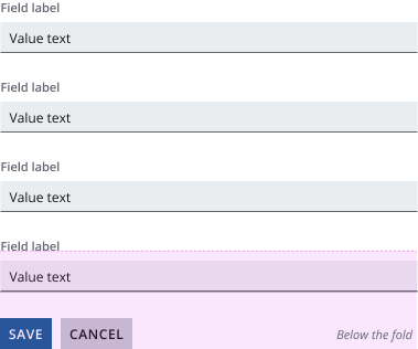
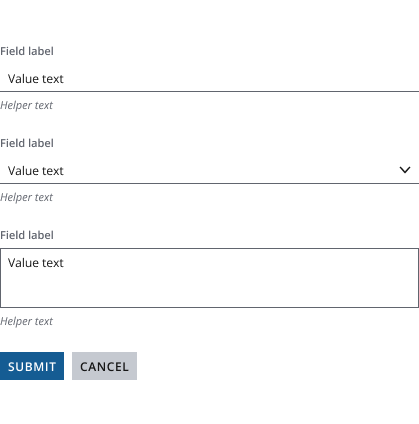
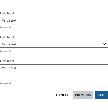
A button bar provides next steps when a user reaches the end of the form. This includes:
- Navigating to previous or next steps.
- Submitting the form.
- Canceling changes.
There are two ways to position the button bar:
Fix the button bar at the bottom of the viewport when:
- A user can proceed (or step back) regardless of form field completion.
- The form is in a wizard.
If form content overflows, the button bar uses a secondary border style.
Display the button bar at the end of the form when:
- The user needs to complete the entire form, or mandatory fields in the form, before proceeding.
- The system needs the user to acknowledge all information on the page.
Hide the button bar border if form content isn’t overflowing behind a fixed button bar, i.e., the user has reached the bottom of the form, or the form is entirely above the fold.
The type of form and/or the form container determines the position of actions (CTA, primary, secondary buttons):
- Groups core actions on the left.
- Follows an F-pattern reading model, to scan easily down the left edge through the form to the actions.
- Groups core actions on the right.
- Next always positioned right of Previous and Cancel to reflect the direction of the steps.
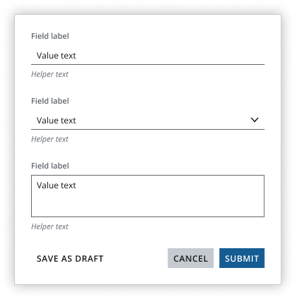
- Always displays core actions on the right.
- Follows a Z-pattern reading model, where actions are the last focal point in the dialog.
In a small viewport (below the xs breakpoint), actions can fill the width for a cleaner layout if button width doesn’t need to increase drastically.
- Group core onward actions for the form together to ensure they remain accessible on browser zoom (e.g., Previous, Next, Cancel, Submit).
- Display secondary actions that aren’t core to the workflow at the opposite end of the button bar.
- For a mobile application, buttons can stack (CTA top > Primary > Secondary bottom) to increase button hit area, proximity to thumb, and to utilize mobile scrolling.
If you need to expand the pattern or share feedback with us, please contact the team.